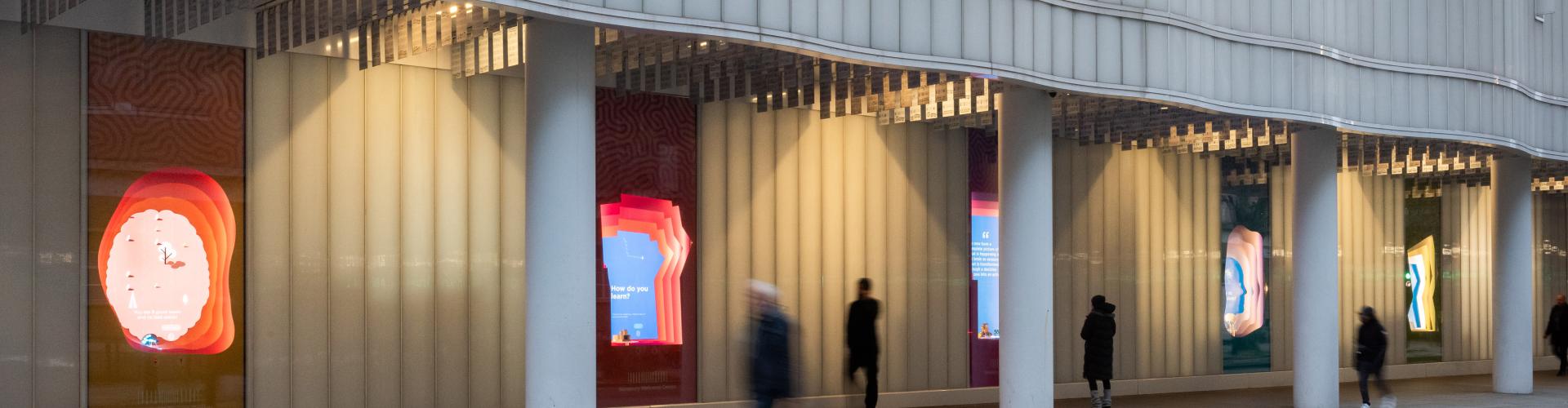
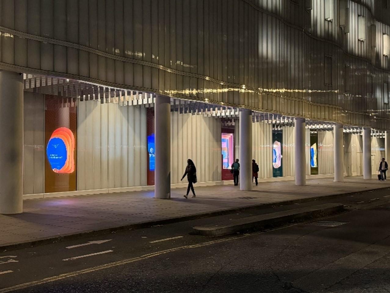
Street Displays
Installations in the vitrines of the Sainsbury Wellcome Centre seek to engage passers-by in our research through a series of questions that highlight intriguing aspects of how the brain drives behaviour. The five exhibits are based on the following topics:
- What is intelligence?
- How do you learn?
- What happens here?
- Why do you sleep?
- How do you make decisions?
What is intelligence?
This exhibit examines what it means to display intelligent behaviour. An interactive digital game allows the user to play the role of a hungry mouse trying to eat as many seeds as possible while avoiding the bad ones.
The game demonstrates how learning from interacting with the world is a key part of intelligent behaviour. It shows how mice, like us, can adapt their behaviour to a changing environment.
The exhibit also explores the differences between biological and artificial intelligence (AI). The game features a simple AI model that maximises seed collection rather than avoiding bad ones. This demonstrates how simple AI agents can be programmed for specific tasks, though they do not learn as quickly.
The display also highlights how researchers at SWC work closely with the Gatsby Unit to understand learning and intelligent behaviour in both brains and machines. One societal impact of our research is the improvement of artificial intelligence.
Brain model
This vitrine contains a model showing how information flows from the eyes through neural circuits in the brain. These neural circuits connect visual areas, which process incoming visual information, to other areas that control behaviour.
Intelligent behaviour is thought to rely on complex interconnectivity between many different areas of the brain performing different visual and other sensory, motor, and cognitive tasks, some performed in parallel.
Read more
How do you learn?
This exhibit explores how we create internal models of the world that are stored in our brains. The interactive digital activity guides the player to navigate to a doughnut shop by turning left and right through a maze. As the player navigates through the maze, a bird’s-eye view of a map appears above, signifying how we build mental models of our environment.
Following the game, there is an explanation of the special nerve cells, such as place cells, that the brain uses to map the world. These cells form an “inner GPS” that make it possible for us to navigate. When you make a wrong turn, these special cells allow your brain to update your internal model of the world.
Working alongside many other types of cells, place cells help us remember and navigate the complex maps of our environment, even when it changes. In a similar way, the same cells in the brain are thought to map our knowledge, allowing us to think and remember through navigating through our knowledge.
The vitrine also highlights how Professor John O’Keefe, who was awarded the Nobel Prize for the discovery of place cells, works at SWC.
Honeycomb maze model
This vitrine contains a 3D printed model of the honeycomb maze used in the O’Keefe lab at SWC to further understand navigation. The honeycomb maze, and the 3D printed model, were both designed and made in collaboration with engineers in our Fabrication Laboratory.
Read more
What happens here?
This exhibit showcases our science, people and culture. Footage taken by a drone flying through the building allows passers-by to see what happens inside.
A range of videos highlight our research and how we are using cutting-edge technology to understand how complex behaviour arises from biological matter. The films also show how discoveries at SWC are leading to societal benefits including new therapies, new methods for teaching, and new scientific equipment that can lead to even better science in the future. Watch our videos on YouTube
Models
This vitrine contains three objects: a robot, a printed circuit board and a microscopy model.
The robot was made by a PhD student during Boot Camp. Boot Camp takes place at the beginning of our PhD course and covers everything from electrons to intelligence. Our students are empowered to build increasingly sophisticated robots, while learning about neuroscience principles and technologies along the way.
The printed circuit board is an example of a poke wall used by researchers to investigate diverse cognitive functions underlying adaptive behaviour. Small LEDS light up to indicate the starting porthole and the sequence required. Infrared LEDs allow each porthole to detect whether a poke has occurred.
The microscopy model shows how light passes through the objective lens of a microscope to magnify objects. This allows us to study neural circuits in real brain tissue. Light microscopy is central to much of the research performed at SWC. A team of experts in our microscopy facility build cutting-edge microscopes to advance our research.
Read more
Why do you sleep?
This exhibit explores one of the key reasons why your brain needs sleep – to consolidate memories. The interactive display explains how our brains collect lots of information each day and that sleep is thought to help sift, categorise and save important memories while clearing the clutter.
The vitrine also highlights how our researchers are seeking to understand more about sleep and what it means for future behaviour.
Sleep has been shown to consolidate memories through ‘replay’ – the sequenced firing of specific neurons associated with performing a specific task.
That’s why it’s not a good idea to skip sleep the night before an exam! Sleeping helps consolidate what you have learned, [and may even pave the way for new ideas to emerge].
EEG cap
This vitrine contains an electroencephalogram (EEG) cap that can measure the electrical activity of the brain. This is one of the tools used by scientists to monitor neural activity during sleep.
Read more
How do you make decisions?
Animals and humans make hundreds of decisions every day. This exhibit explores how we weigh different factors in decision making through a series of interactive games.
The first game offers a monetary decision between receiving a smaller amount today or a larger amount this time next year. The game is set up to randomly display three different magnitudes: £100 today, versus £120 this time next year; £1,000 today versus £1,200 this time next year; and £10,000 today versus £12,000 this time next year.
Following the game, the interactive display shows how the player compares to others who have played the game, and then explains how individuals differ in their impulsivity and how much they can delay reward. Decisions depend on context, personal experience and genetics.
The second game explores social decisions, which are difficult to study in the brain as they involve a lot of uncontrolled variables, such as inferring what another person is thinking. External factors, such as another player’s action, interact with our own internal state and past experience.
In the game, the player has to choose which side to move to save a goal. Following the outcome, the interactive display explains how game theory concepts, such as the Nash Equilibrium, can help us to understand. For example, in penalty kicks, a 2 x 2 matrix can be formed with the kicker trying to mismatch and the goalie trying to match sides.
The third game displays a visual scene with two different routes back to shelter: risky or safe. The player is asked to choose which option the mouse should take and is shown how their chosen option compares to others who have played the game.
When making decisions, animals must weigh up the costs/benefits of each option. Animals may have a different level of risk aversion depending on many factors including how hungry they are, how tired they feel and how much stress they are under.
In addition to the games, the vitrine explains how at SWC we are investigating how the brain computes such decisions by integrating incoming information with prior knowledge.
We are starting to uncover how the brain chooses the most favourable decision in a given moment, by exploring the impact of context, including brain state, risk and uncertainty, and social environment.
Equation
This vitrine contains an equation written on a whiteboard that relates to the monetary decision game. The equation is called hyperbolic discounting, and it explains why the subjective value (U) of an option in the future is less than if you got it immediately.
V is the objective value; t is the delay; k is the discount factor.
Impulsive individuals have a higher k, patient individuals have a lower k.
Read more
- Scientists explain how the brain encodes lottery values
- Dr Chunyu Ann Duan awarded ERC Starting Grant
- Mice choose best escape route without ever experiencing threat
- Navigating to safety by memorising subgoals
- Neuroscientists demonstrate flexibility of innate behaviour
- Brain’s ‘escape switch’ controlled by threat sensitivity dial
Privacy and Data Use in SWC Interactive Displays
The interactive window displays at the Sainsbury Wellcome Centre use distance sensors to activate visual effects. The displays respond to movement – such as a wave of the hand or an object passing in front of the sensors – and do not require physical contact.
We are committed to protecting privacy. Please note:
- No personal data is recorded or stored at any point during interactions with the displays.
- Interactions remain entirely anonymous. The only data collected is the aggregate number of interactions, which helps us monitor overall engagement.
- The media players powering the displays are not connected to the internet.
Colonnade Soffit Artwork
The Sainsbury Wellcome Centre colonnade features 950 polycarbonate pixels with different visual representations when viewed from the East or West.
Artwork viewed when looking West
Music pixels reproduce the score of Johann Sebastian Bach’s J.S. Bach’s Musical Offering (1747): Ricercar a 3 - regarded as an extraordinary expression of human imagination.
Artwork viewed when looking East
Portrait pixels depict 11 separate winners of the Nobel Prize in Physiology or Medicine affiliated with University College London whose rigorous scientific investigations have benefitted humanity.
- Professor Archibald Vivian Hill 1922
- Sir Frederick Gowland Hopkins 1929
- Sir Henry Hallett Dale 1936
- Professor Peter Brian Medawar 1960
- Professor Francis Harry Compton Crick 1962
- Professor Andrew Fielding Huxley 1963
- Professor Sir Bernard Katz 1970
- Professor Ulf Svante von Euler 1970
- Professor Sir James Black 1988
- Professor Bert Sackmann 1991
- Professor Sir Martin Evans 2007